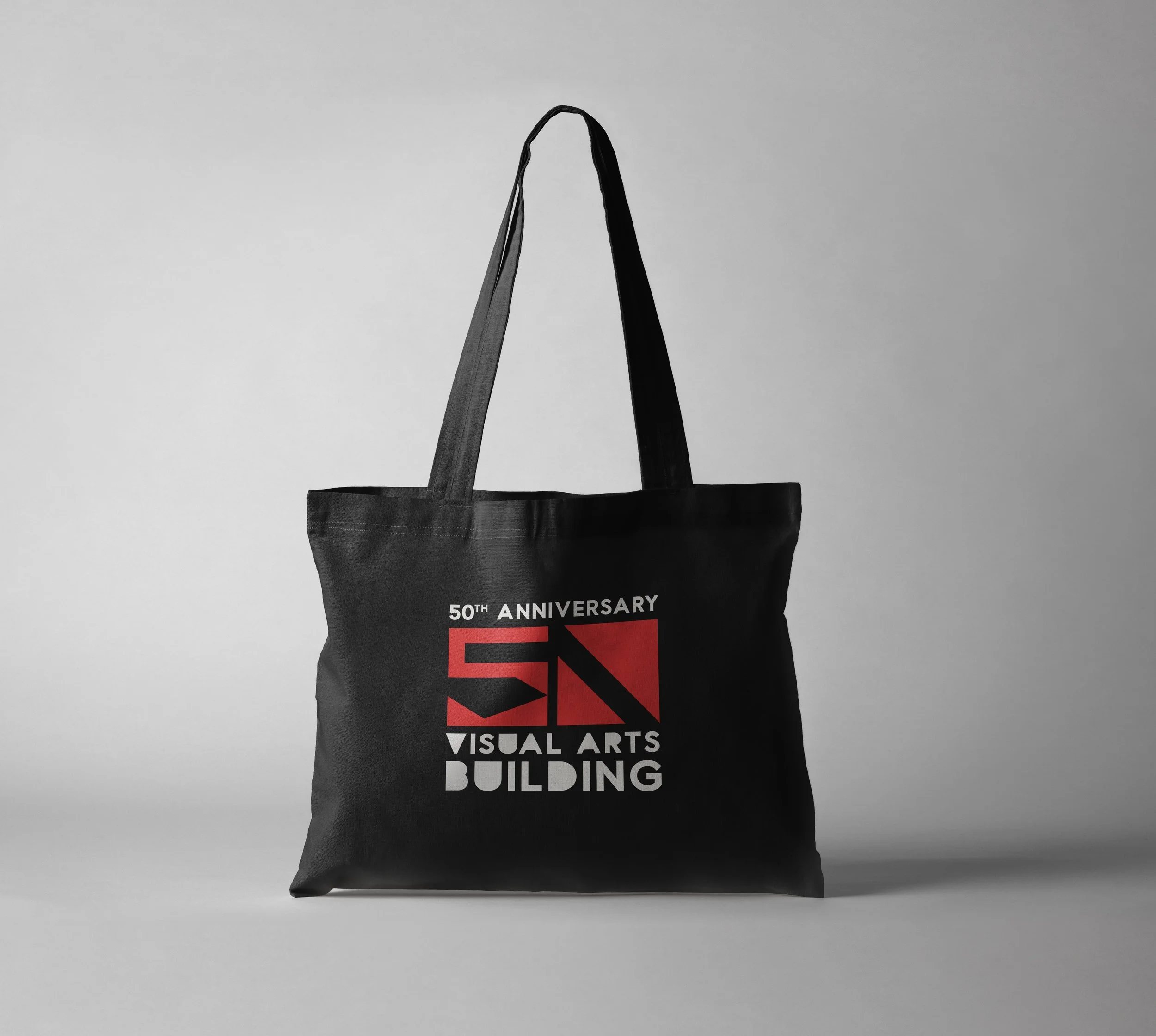
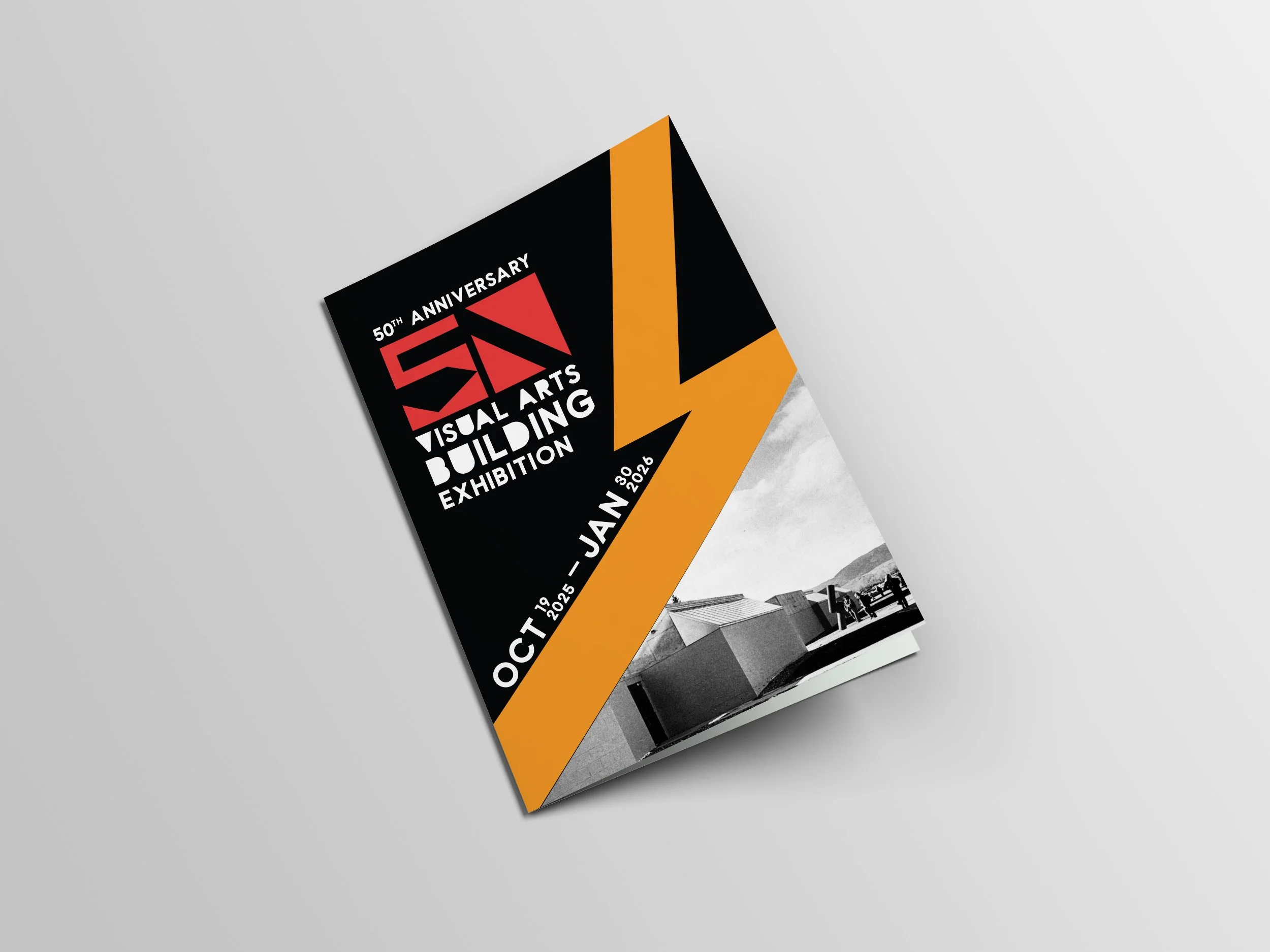
Celebrating 50 years of Colorado State University’s Visual Arts Building
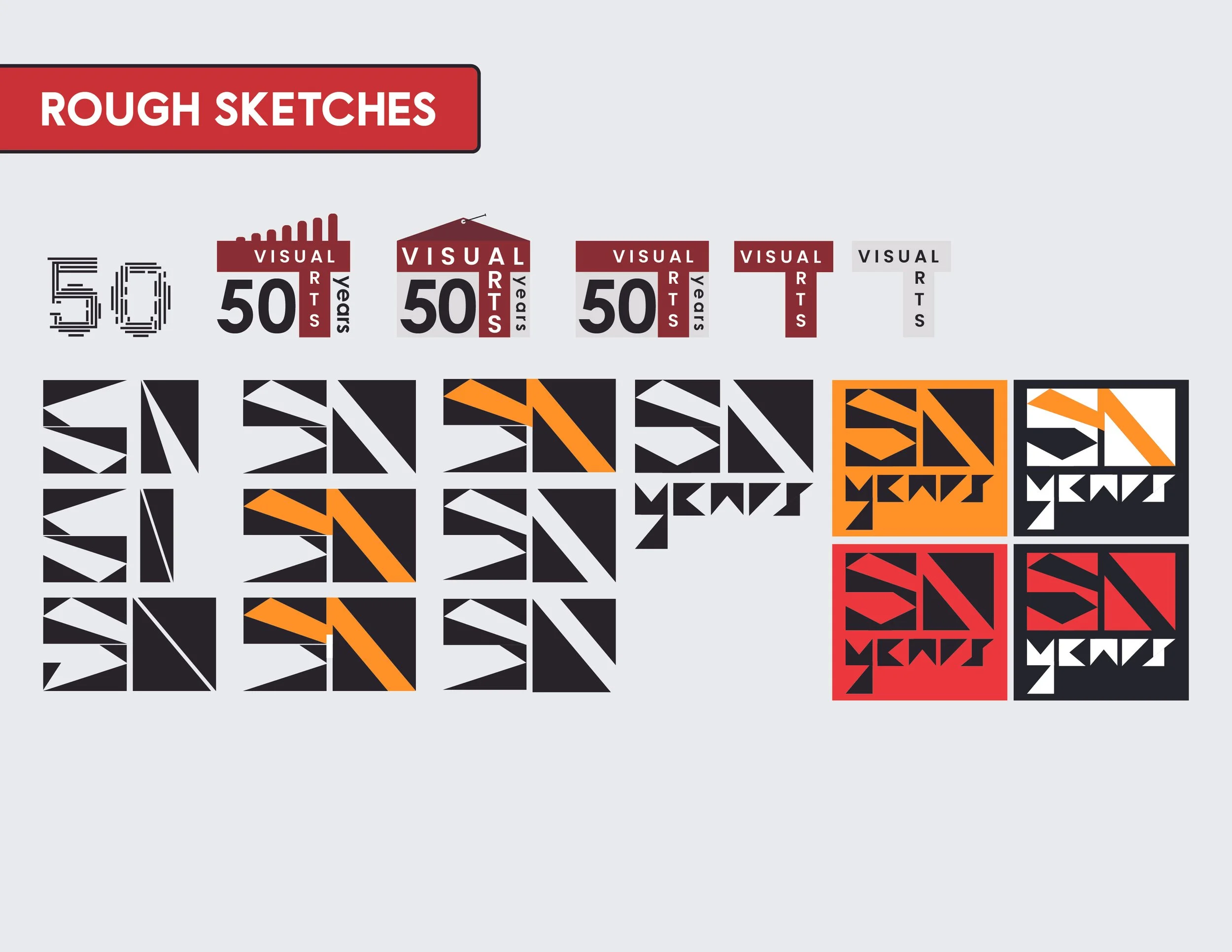
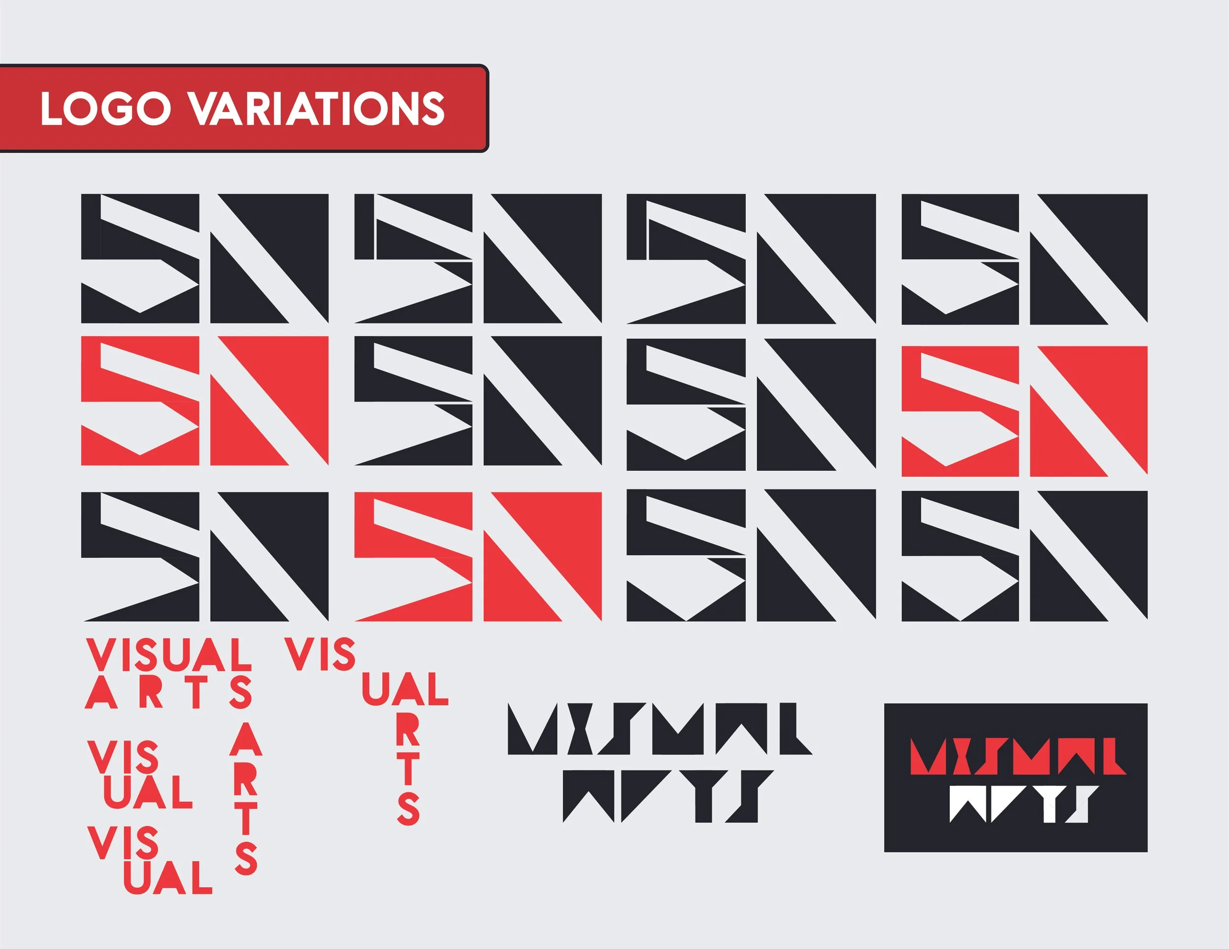
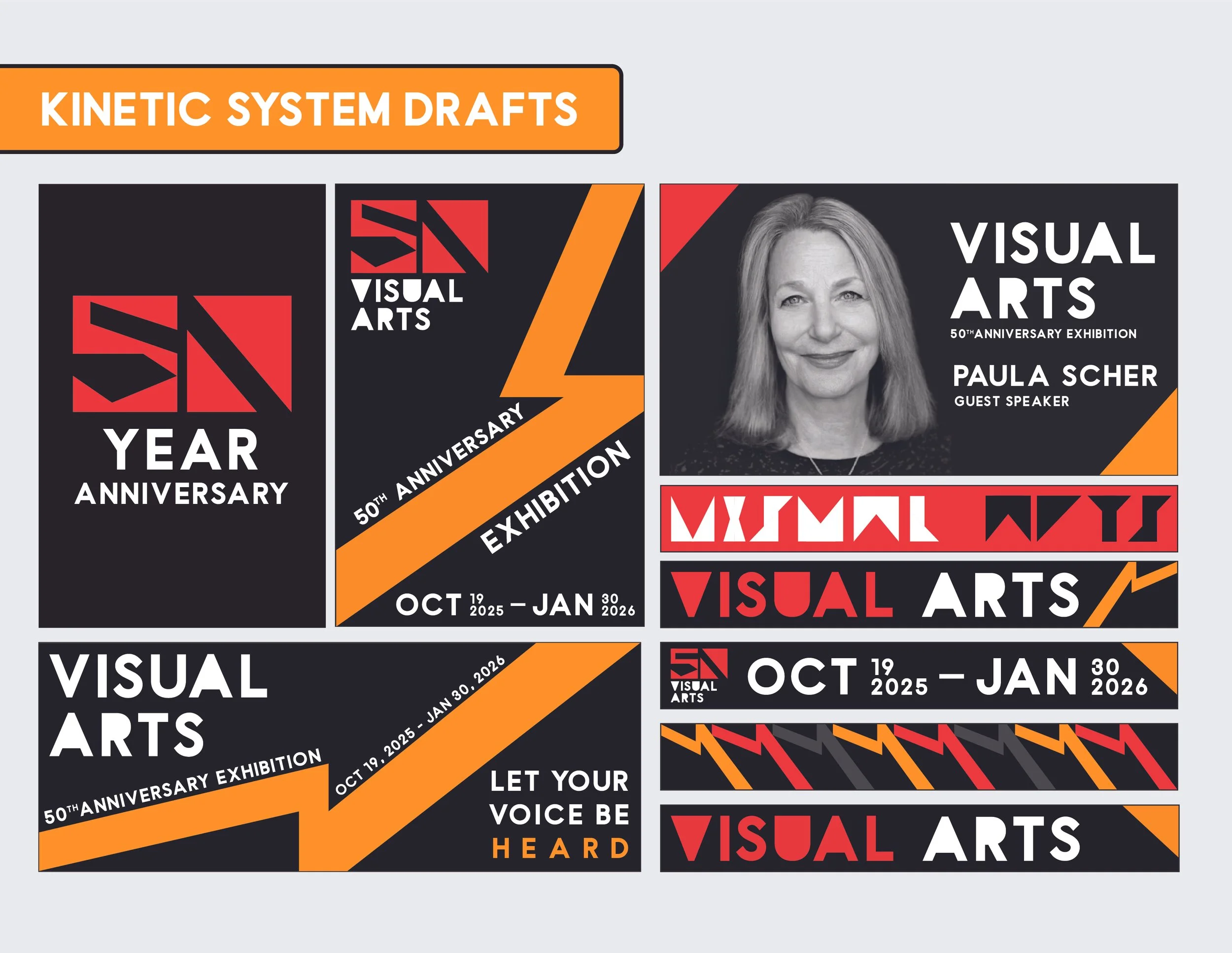
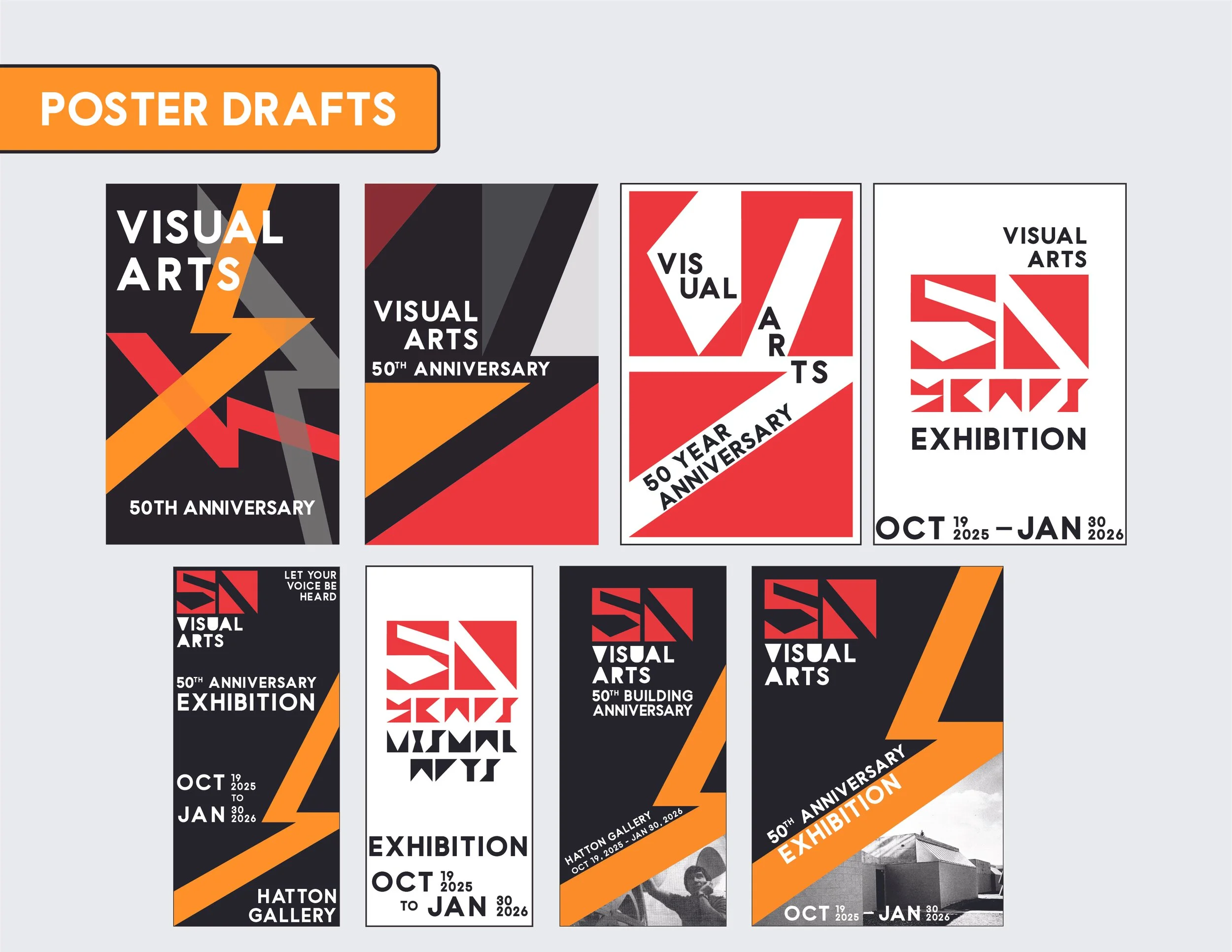
My idea for the logo was based on the brutalist aesthetic that the Visual Arts building gives off, so I only used rectangles and triangles to make the “50”. After making multiple variations of the “50”, I noticed there was a lightning bolt-like pattern visible between the two numbers, which perfectly references the orange lightning bolt sculpture outside at the main walkway. I used these elements to create a brand identity for the exhibition.